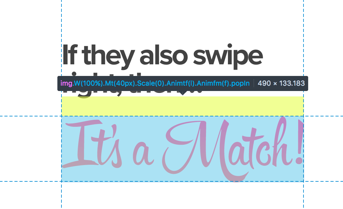
Text is an image with no alternative content
Tinder uses a image for showing a text in the main header, and provides no alternative content to it.
People using screen readers would only understand “If they also swipe right, then…”.

Read Images of Text for more on this kind of issue.
- Software: Chrome 61