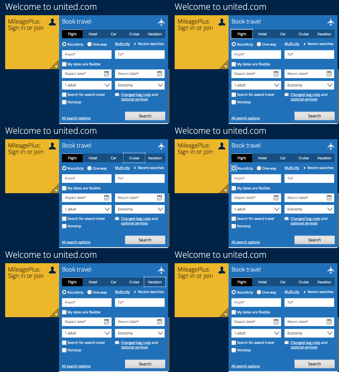
Confusing and unexpected navigation in tab component
Updated on February 2nd, 2018
In “Book Travel” section on United Airlines website, although you can navigate through the tabs using arrow keys, the way they were designed don’t hint about their logical organisation: “Flight”, “Hotel” and “Car” are in the same group, but they are visually presented as if they were in the same group as “Cruise” and “Vacation”. It’s not the case, though, which introduces an unexpected jump during the navigation.
Also, since it suppresses tab navigation, users are only able to use arrow keys to navigate between them.
On Safari, you can only access the “Flight” option.

- Software: Chrome 63, Firefox 57.0.4, Safari 11.0.1